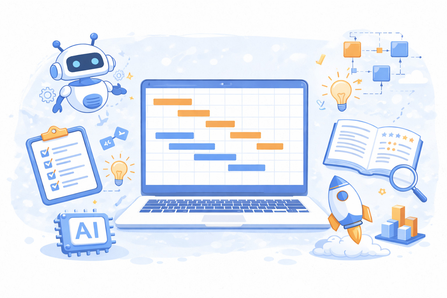
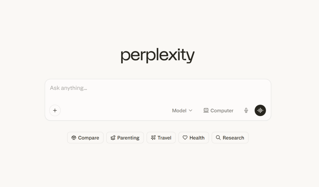
Perplexity is an AI search and answer tool. It works like a smart research assistant. You ask a question, and it gives you a clear answer, often with structured tables and summaries.
Perplexity can generate organized project data, tables, and visual outputs that you can export and then use in Excel, Google Sheets, or a project-management tool to help build a Gantt chart.
In this guide, you’ll find how to create a Gantt chart with Perplexity and how to combine it with project management software for a complete workflow.
And if you have any questions that are not covered in this article, you can always connect with our team via info@goodday.work
Steps to create a Gantt chart with Perplexity
While Perplexity can create charts, dashboards, and spreadsheets based on your prompts, those outputs are not built-in Gantt charts like you would find in dedicated project management software. They provide structured project data which you can move into a Gantt-ready tool like GoodDay to turn the table into a working timeline. So, let’s explore how to create a Gantt chart with Perplexity.
Step 1: Define your data
List your project tasks, start dates, end dates (or durations), and dependencies.
Step 2: Use a specific prompt
Ask Perplexity to create a Gantt chart based on your data, for example: “Create a detailed Gantt chart for a 3-month website redesign project. List tasks, start/end dates, and dependencies, and format it as a table.”
Step 3: Generate and visualize
Perplexity will generate a table or a visual chart.
Step 4: Export data
If a table is provided, copy and paste it into Excel or Google Sheets, then use the chart tools to create a bar chart. Also, instead of manually building a bar chart in a spreadsheet, you can paste the structured task list into GoodDay and switch to Gantt view. This instantly converts your data into a real timeline with task dependencies, drag-and-drop scheduling, and progress tracking.
Step 5: Refine the chart
If the output is not satisfactory, ask Perplexity to refine it by adjusting dates or adding dependencies.
Why teams choose GoodDay for Gantt charts
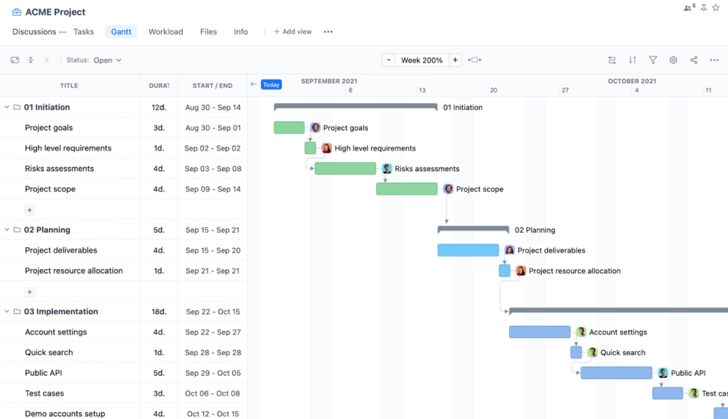
GoodDay is an all-in-one project management software with highly configurable Gantt chart functionality. It is used by Fortune 500 companies, fast-growing startups, and established teams worldwide. The platform has been recognized as top software in 12 Capterra shortlists.
With GoodDay, you can:
- Drag and reschedule tasks directly on the Gantt timeline
- Connect Gantt charts with tasks, goals, and team workload
- Track progress in real time
- Plan across multiple projects in one unified view
If you have questions about building your Gantt chart or want to see how GoodDay can support your workflows, contact our team at info@goodday.work
FAQs
Can Perplexity generate charts?
Yes, Perplexity can generate charts through its Labs feature when you provide a clear prompt. It can structure data into tables and simple visuals based on web research. These outputs help users quickly visualize timelines or comparisons. However, the charts are basic and not designed for ongoing project execution.
Can Perplexity generate a Gantt chart?
Perplexity can format schedule data in a way that helps create Gantt charts, but it does not provide native timeline functionality. It relies on you entering a detailed ai prompt describing tasks and durations. The output is typically a structured table rather than a fully interactive schedule. You must move that data into dedicated project management software to manage dependencies properly.
Is there an AI that can create a Gantt chart?
Some ai tools can generate draft schedules based on structured input. They analyze task names, durations, and dependencies to produce organized output. These systems are helpful for early planning but are not designed to track progress across complete projects. For full execution control, a specialized project management platform is more effective.
What is the best tool for creating a Gantt chart?
If you need structured planning support, Perplexity is useful during early research and ideation. It can gather cited sources and organize information for new projects. However, project managers typically require dependency mapping, workload tracking, and real time updates. GoodDay provides those capabilities inside a unified project management environment.
Which AI tool is best for creating charts?
Perplexity is strong for research mode because it compiles information from multiple data sources across the web. It can generate structured tables and basic visualization outputs. Its web focus makes it useful for exploratory analysis and market research. For operational scheduling and deeper visualization, GoodDay remains the stronger choice.
How to auto generate a Gantt chart?
Start by entering a detailed example prompt into the input bar describing tasks, durations, and dependencies. Perplexity will return structured output that you can export. You can then import that file into project management platforms to build a working timeline. This approach combines ai-generated planning with execution tools.
Can Perplexity Labs generate interactive dashboards from structured project data?
Perplexity Labs can generate dashboards from structured data. It supports limited code execution to create formatted outputs. These dashboards may include interactive charts, but they are not deeply connected to ongoing workflows. They function more as analytical reports than live tracking systems.
What can you build with Perplexity Labs beyond simple tables and summaries?
With Labs, you can build lightweight web apps, simple reports, and visualizations. It can also generate html output and basic interactive web applications. These outputs are helpful for presentations and exploratory planning. They are not designed to manage full development processes.
Is Perplexity capable of creating interactive dashboards for reporting project progress?
Perplexity can produce dashboards and structured reports within Labs. These dashboards may include interactive elements, but they do not automatically update project status. They are useful for summarizing findings and visualizing insights. Dedicated project management software is better suited for continuous monitoring.
Does Perplexity support advanced data visualization?
Perplexity supports basic data visualization such as tables and simple charts. Its main strength lies in research and structuring data from various sources. It can help visualize early ideas but is not optimized for complex timeline modeling. GoodDay provides more advanced visualization tailored to active project workflows.
Is Perplexity suitable for planning complex projects with multiple dependencies?
Perplexity is useful for market analysis and breaking down tasks during early planning stages. It helps structure project plans and answer specific questions with summarized answers. However, managing complexity across complete projects requires dependency tracking and centralized coordination. GoodDay is better equipped to handle execution, resources, and multi-project oversight.


