Communication & Process Flows
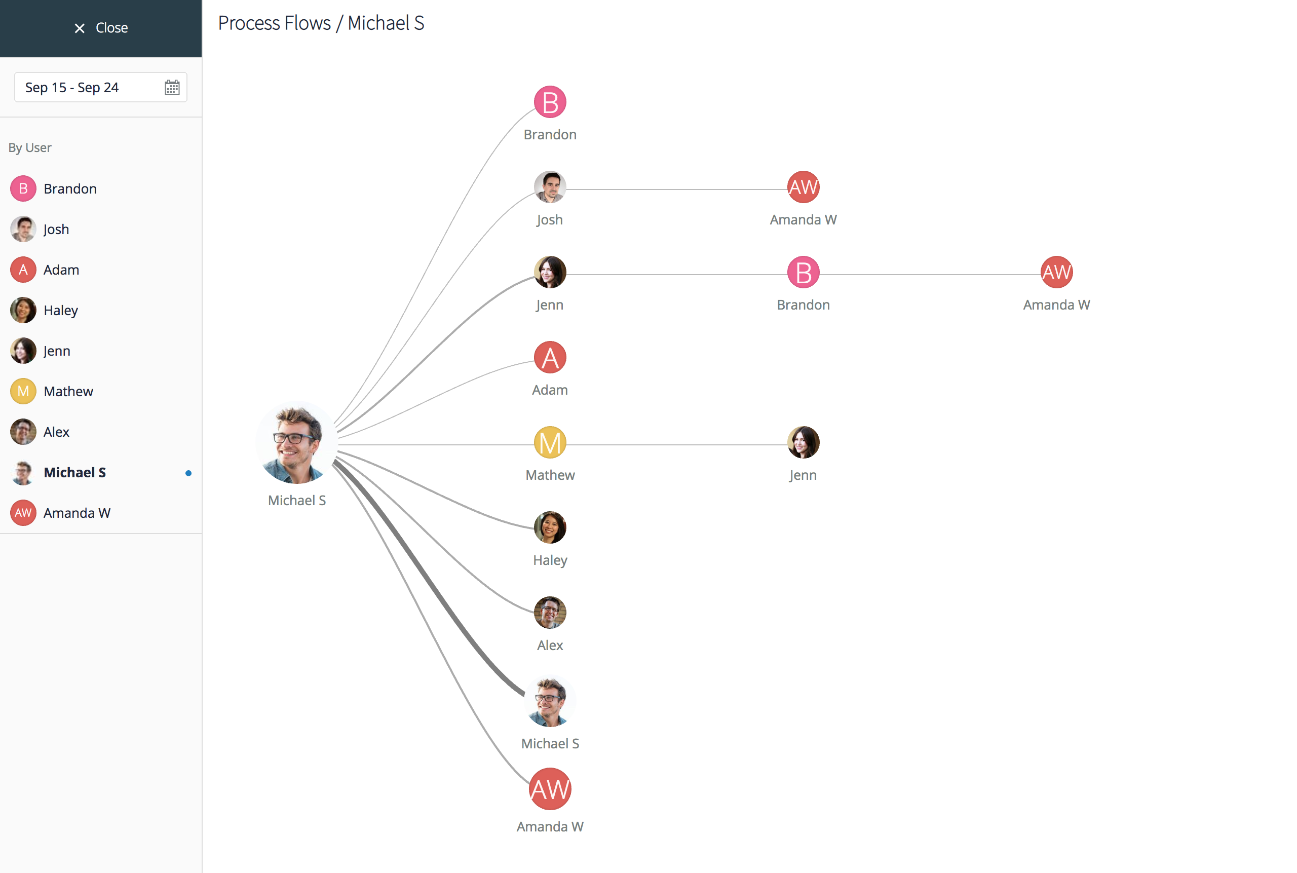
Process Flows
To understand how communication flows through your entire organization, within a team, or between individual users, select the time period in the calendar widget on the left and pick a user you want to start with. The resulting chart will explain how that selected user communicates with others. The thicker the connecting line, the more work processes flow between the two connected users. A line splitting into several branches and going beyond 1x1 communication illustrates that there are several people involved in multiple typical workflows that a chosen user initiates. If you mouse-over a set of process flow lines, you will see the distinct branch highlighted and numbers next to users will indicate the amount of activity that has occurred within the specified time period.
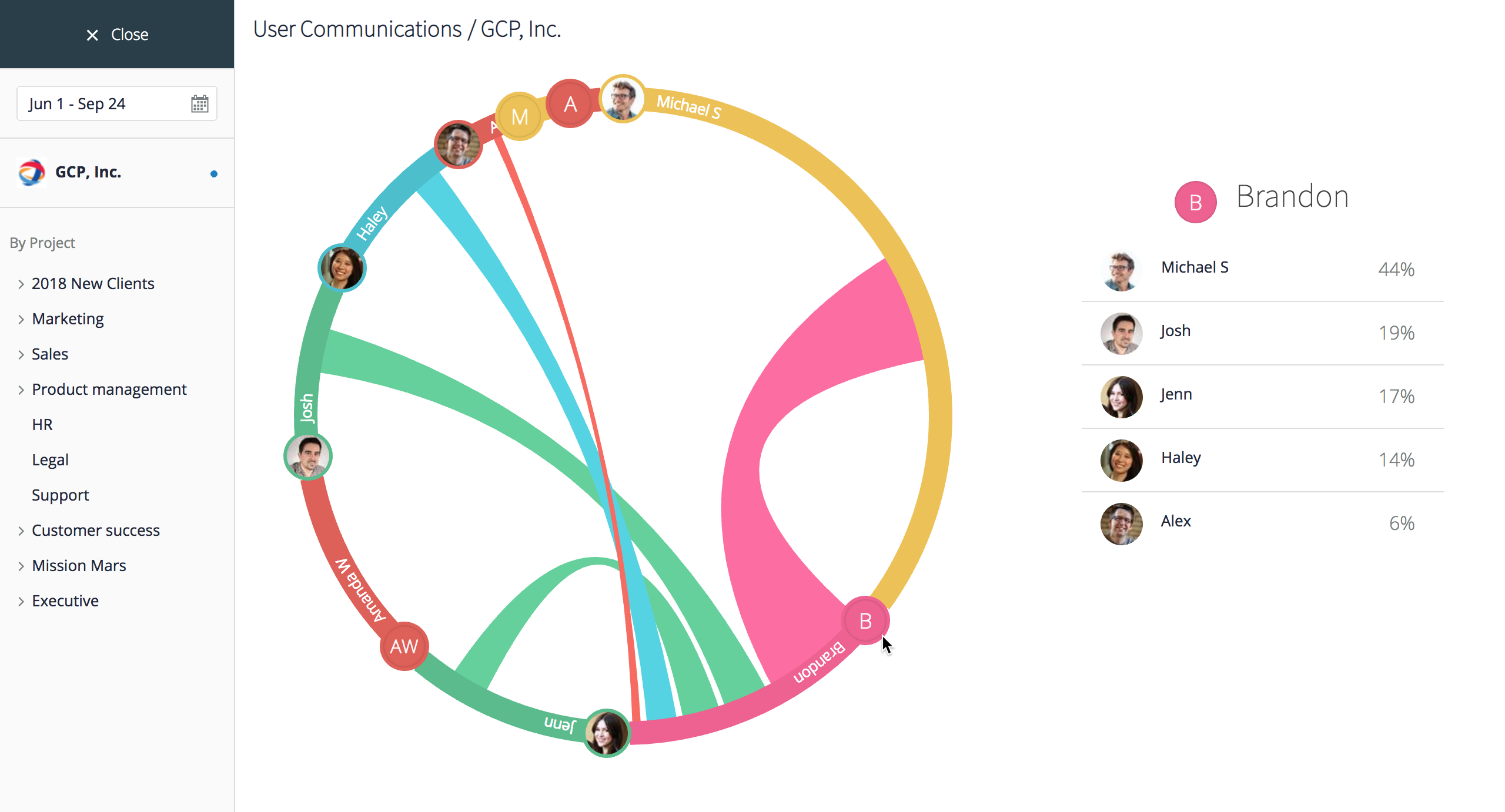
Communication
To analyze communication patterns within your organization, go to Communication and select the time period with the calendar widget in the menu on the left. By default, you will see a communications chart for all users of your organization, with data based on all projects for the defined time period. The table on the right details the % of all communication each user has been responsible for. If you choose a specific project in the left menu, you will see more focused data and will be able to evaluate how the project team communicated on tasks.
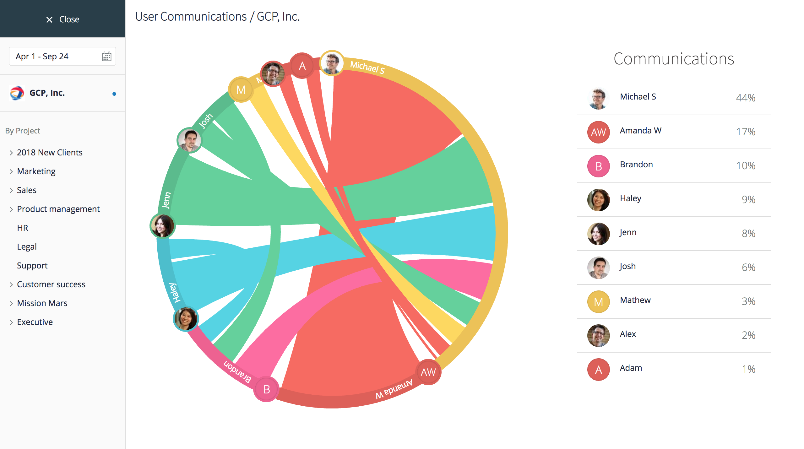
Mouse-over the colored segments representing each user on the chart to zero-in on that user’s communication flows with others. The thicker the colored strip connecting two users, the more they have communicated with each other on a project you’ve selected. The table on the right updates accordingly as you mouse-over, to show the % of communication your selected user has had with each user on their team. If you are in a default view (all projects for your organization), you can also mouse-over to focus on one user.
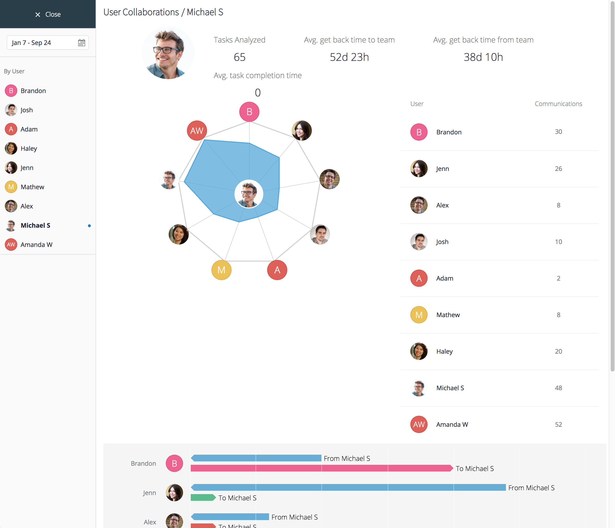
Collaboration
This section of GoodDay analytics is one of the most important for team leaders who look for specific opportunities to improve team dynamics, responsiveness, and collaboration quality.
Select the period of time you’d like to review collaboration metrics for, pick a user you want to focus on, and review several key metrics and charts for the selected user. The system will display how many tasks the user collaborated with others on during the selected period of time, how quickly he or she was getting back to the team (Avg. get back time to team) and how quickly the team, on the average, was getting back with responses to this user (Avg. get back time from team). The user with a ‘get back time’ that is lower than the team’s average is clearly more responsive than the team overall. Average task completion time metric will also show how quickly the user in fact closes his or her tasks.
The graph in the center of the screen illustrates how much collaboration has occurred between the selected user and others during the reporting time period, and the bar chart on the bottom will reveal who responds to a selected user the fastest or the slowest. You can mouse-over the bars to see the exact number of days responses took on the average.