Behavior
Self-Organization
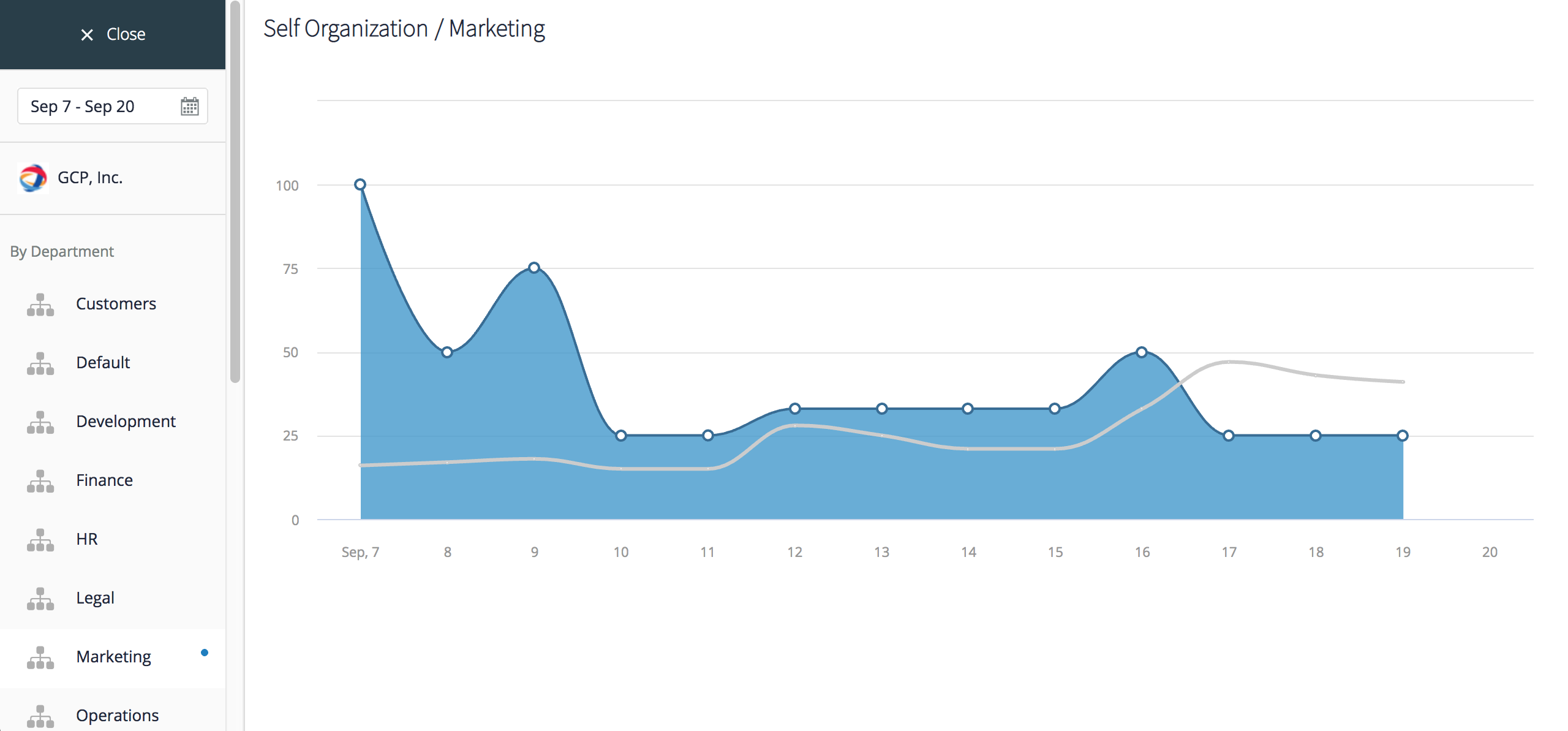
GoodDay helps your team stay organized and, to evaluate progress, includes analytics that help measure self-organization.
Choose your time period in the calendar widget on the left and view the Self-Organization chart for the entire organization. If there are no unplanned (in Inbox) tasks, the metric will reach 100%, and, consequently, the chart will trend down if the teams are not well-organized. To focus on a particular department, pick one from the menu on the left and you will see how its organization levels compare to the company average.
To view how organized your individual team members are, select a specific user from the menu on the left. The trending chart will display this user's organization levels as compared to the organization’s average, and the table at the top of the screen will show whether the user was perfectly organized (happy Daily Badge, based on the user Daily Badge settings) on each day of the time period you defined for this analysis.
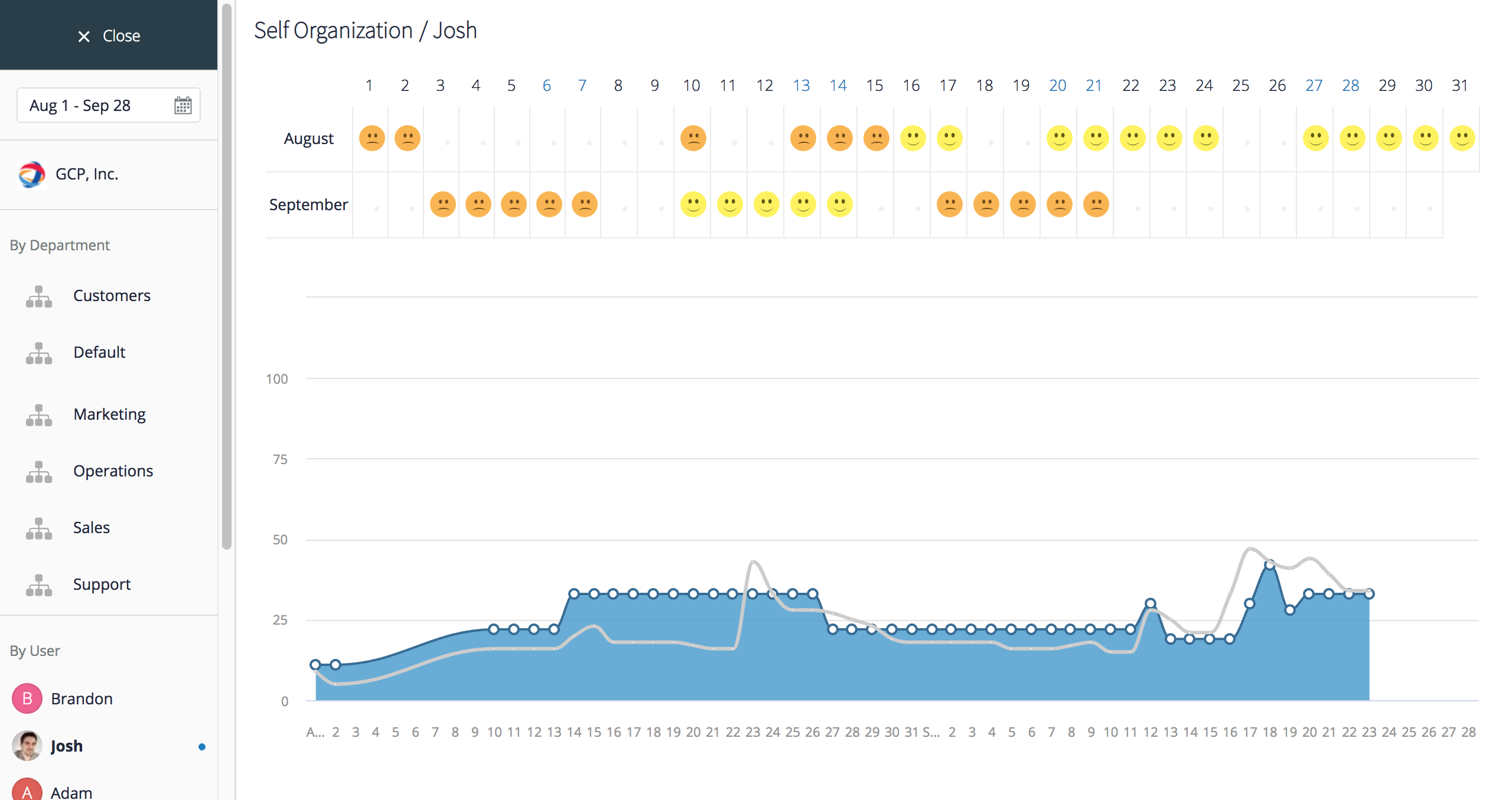
Note: read more about the Daily Badges and how to configure the Daily Badge criteria for each user in User Management > Daily Badges.
Self-Planning
GoodDay evaluates planning quality automatically based on how well users plan their tasks and complete them on the day they have planned tasks for. Choose the reporting period with the help of the calendar widget on the left, review the default analytics for the entire organization or choose a department or user. Departmental and individual user quality of planning will be compared to the organization’s average on the chart. Mouse-over to view details for each day.
Average Response Time
To measure the agility of the entire organization, department, or user, GoodDay uses the average response time metric that can be analyzed for any period of time and compared along several dimensions. By default, you will see analytics for the entire organization after you’ve selected your time period in the calendar widget on the left. You can also select a department to compare its agility to the organization’s average. The fewer days it takes a department to respond to tasks, on the average, the more agile its performance.
If you select a specific user, the chart will show how their response time compares to the organization's average. Mouse-over a data point to see the exact number of days it took the user or the organization on the average to respond to tasks.


