/
October '16

October '16

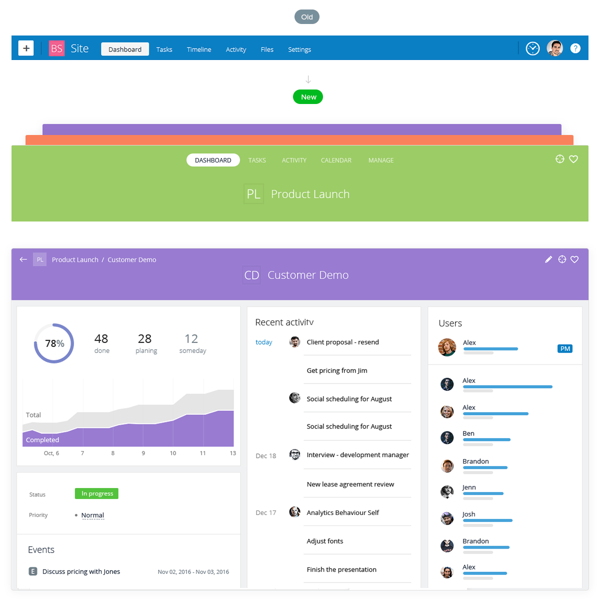
New headers

To improve the user experience and add more visual cues throughout the application interface, we completely redesigned the top panel and project headers. The project headers are now color-coded, using the project’s color, which makes it easy to navigate and reduces the chance that a user will create a task within a wrong project.

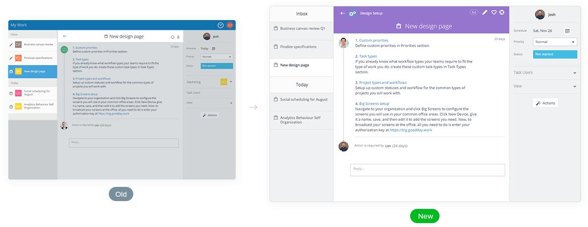
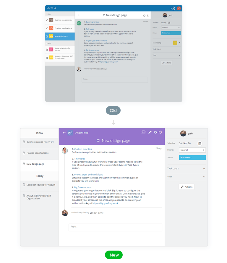
Task view

In accordance with the new color-coded project headers, the Task View was completely revamped. The related tasks navigation was significantly improved. The top panel of the task screen inherits the project color, and it’s very easy to see where each task belongs. The top panel has become more informative and includes a full path to the task (including groups, subgroups, etc.) as well as the task ID, which is useful for quick search or when referring other users to specific tasks.

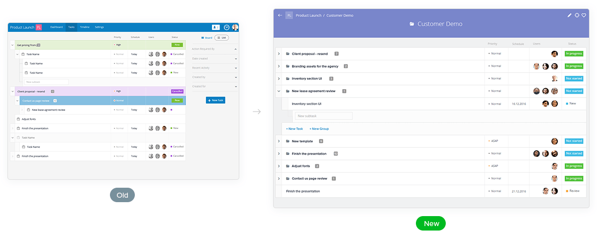
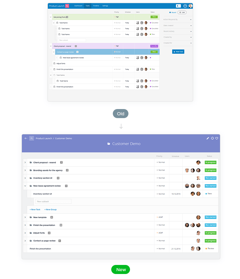
Task list redesigned

The list of project tasks now has a new, clean look and a improved controls and functionality. The new design makes it easy to create groups, subgroups and tasks with unlimited nesting levels. The user experience is intuitive and seamless with easy drag-and-drop controls, the ability to update task priority and status from the task list, and more useful tools.

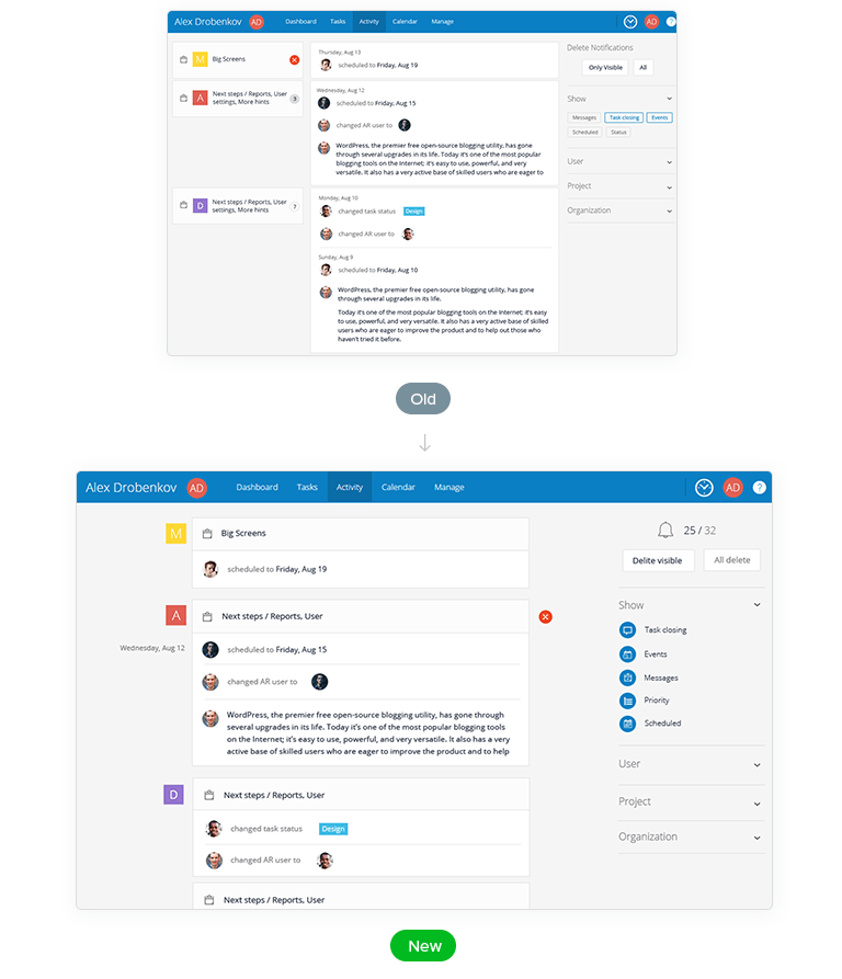
Notifications

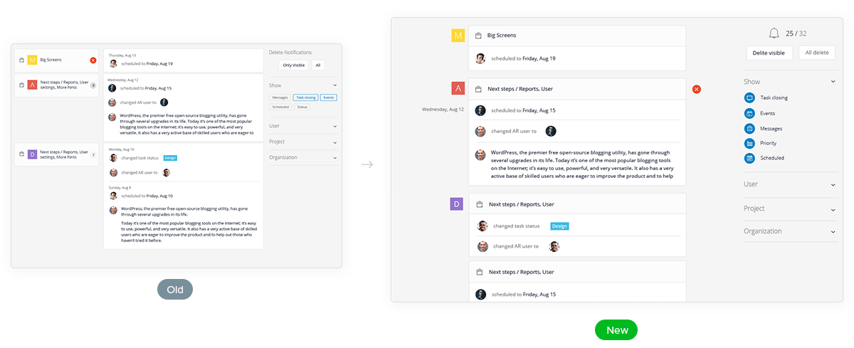
We upgraded the Notifications screen functionality to give users complete control over what types of notifications they want to see and focus on. Now you can use this screen as a customizable dashboard that allows watching the work activity by project, user, organization, or just for the tasks you are a part of. Notification filters can be applied to help you focusing on the type of activity you want to see - task updates, messages, and/or scheduling activity, and new editing filters allow deleting all notifications or only the visible ones.